Airties Sub-branding

The Challenge
As Airties expanded its product portfolio to include distinct solutions for homes, enterprises,MDUs, and testing, the master brand needed a system to differentiate these offerings without diluting the core identity. The challenge was to create a cohesive family of sub-brand logos that felt distinct yet undeniably "Airties".
The Solution
I designed a modular sub-branding system that introduces a unified typographic and visual language for the entire product suite. This included creating distinct but harmonized logos for:
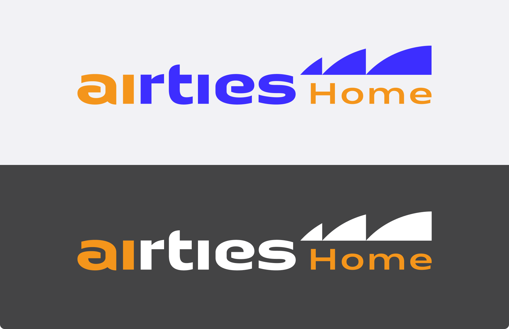
- Airties Home: The core consumer connectivity solution.
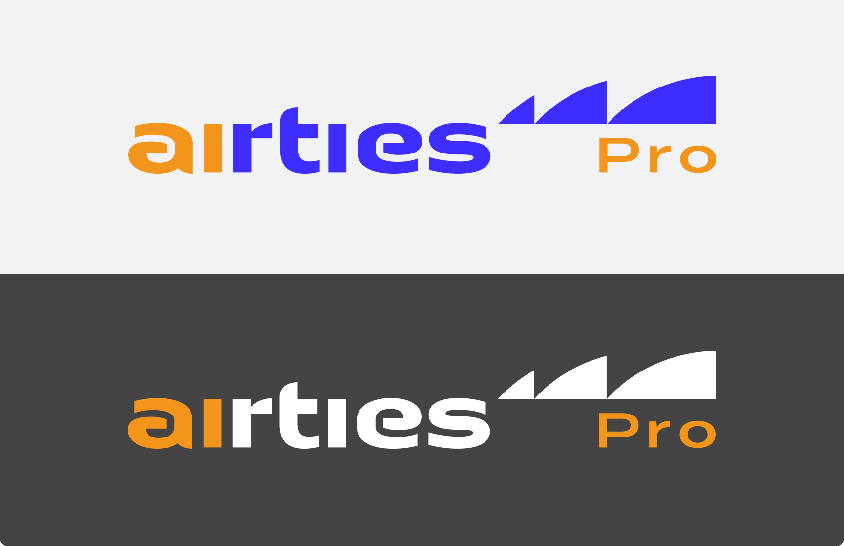
- Airties Pro: The enterprise-grade management platform.
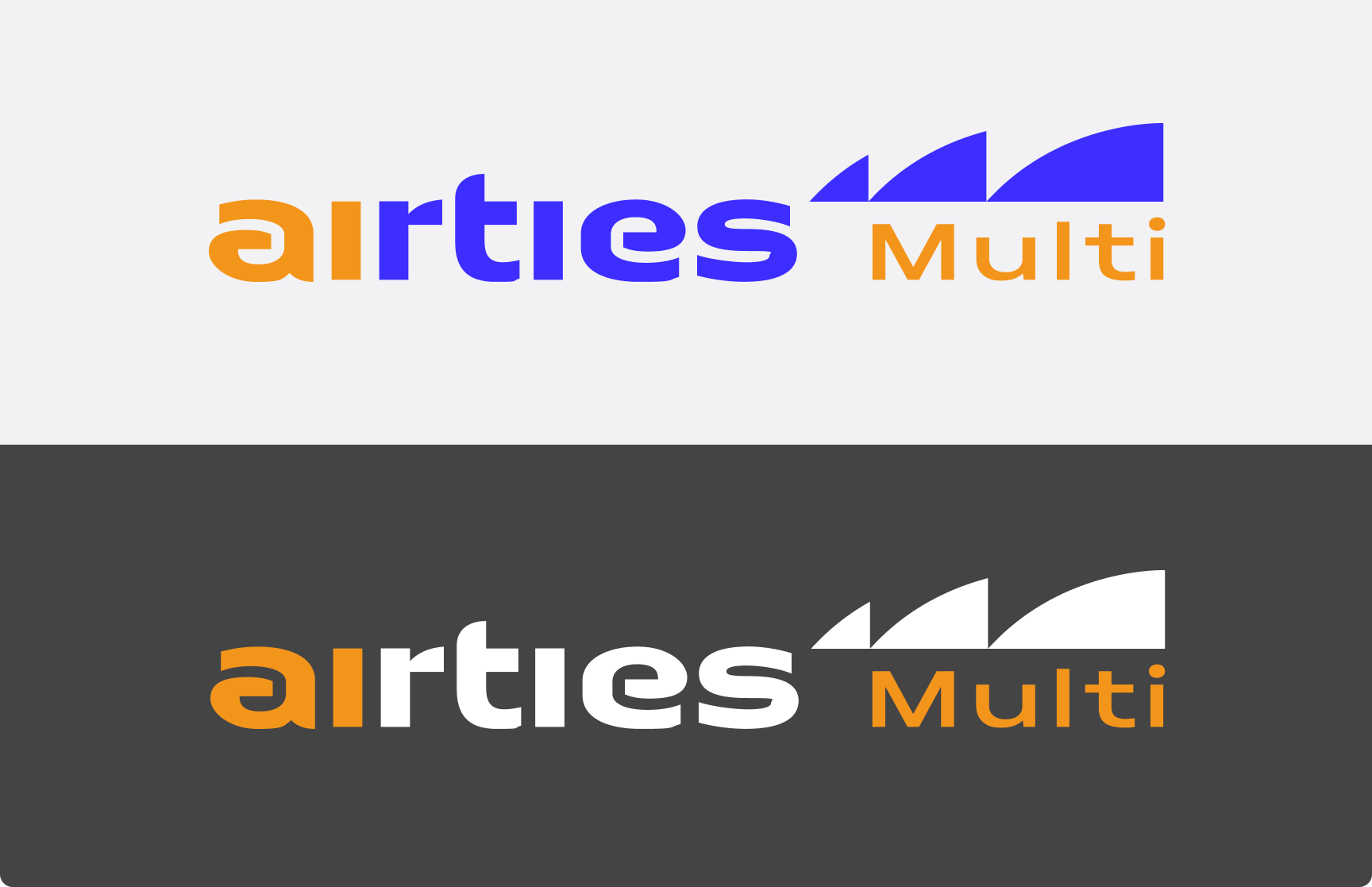
- Airties Multi: The dedicated MDU connectivity suite.
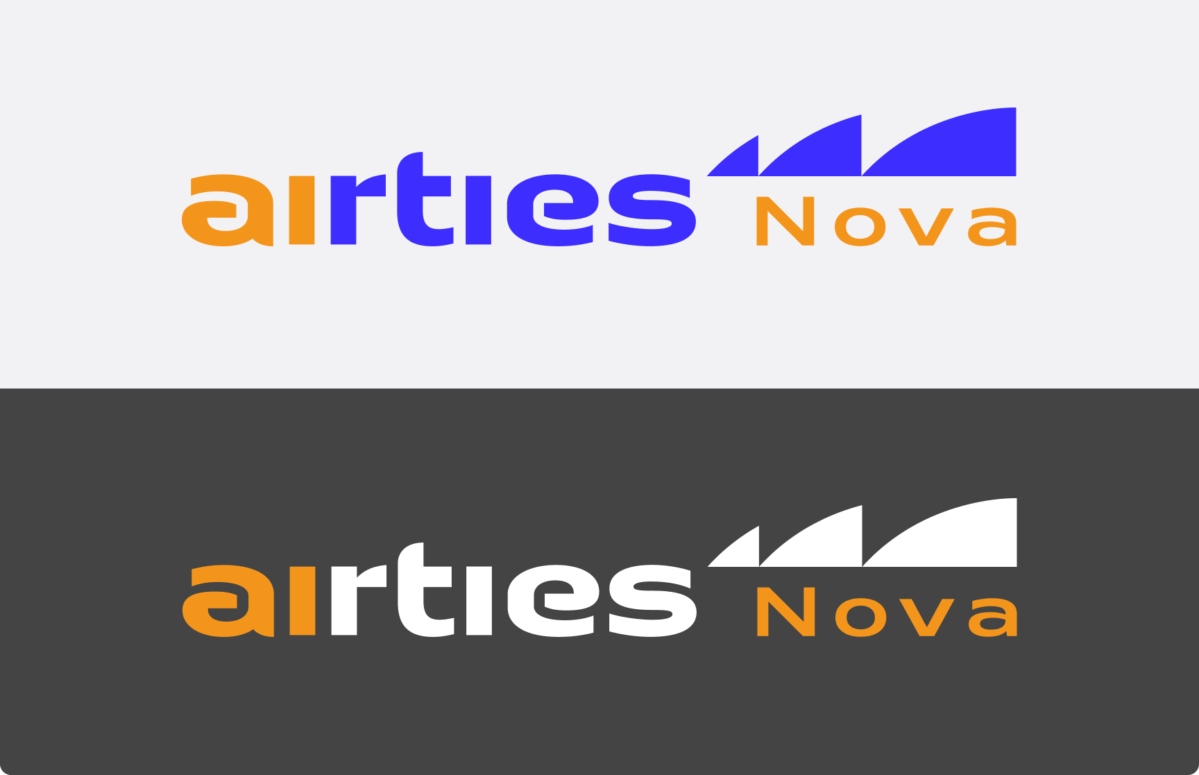
- Airties Nova: The automated testing and validation platform.
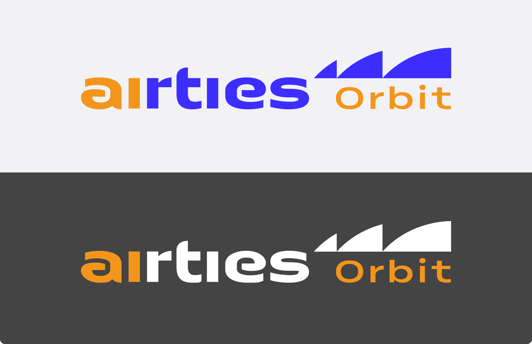
- Airties Orbit: The continuous network optimization engine.
Each logo maintains the master brand's DNA while utilizing specific color coding and subtle formal variations to denote its specific function within the ecosystem.
Key Visuals